


With the spread of COVID-19 on the rise throughout the United States, each new day means a new flood of facts and figures about the current threat and daunting future of the contagious disease. But with so much information coming from so many sources, it’s sometimes hard to know when or if we’re getting the full picture.
The New York Times has all but cornered the market on colorful infographics to inform readers about what the novel coronavirus will do next, and how to avoid it through social distancing. But the truth is more than what we’ve been told.
WUVA has obtained access to a catalog of infographics that The New York Times refuses to publish. They are reproduced here in the interest of public health and safety.
1. Percent of Tom Hanks that have coronavirus
This harrowing infographic shows that every single Tom Hanks on the surface of the earth has now tested positive for coronavirus. A sobering statistic that the supposedly-unbiased New York Times didn’t think was fit to print. It just goes to show how honest (or dishonest) even the most reputable sources can be in an age of fake news alternative facts.
2. March Madness predictions
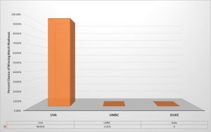
Analysts from The New York Times ran over a thousand simulations in secret to create this infographic. As you can see, if March Madness had gone forward as scheduled, UVA’s team would have had a 99.9% chance of winning the championship, followed by UMBC with a 0.01% chance. Though original graphic included every team that was projected to get a tournament bid, this has been altered to show that Duke had a less than 0.01% chance of taking home the title.
3. Where do you sneeze?
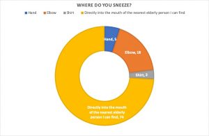
After a CDC survey showed that only 69% of men and 35% of women washed their hands after using the bathroom, The New York Times decided to dig deeper. For this infographic, Times pollsters asked 100 people how they covered their mouth when sneezing. Despite the fact that the CDC recommends sneezing into your elbow to limit the spread of germs, 74% of respondents said that they sneezed directly into the mouth of the nearest elderly person they could find. It should come as no shock, then, that the elderly are one of the most susceptible groups to coronavirus. It’s too bad that The New York Times decided to withhold this important information, potentially jeopardizing the health of millions, to protect their own journalistic interests.
4. Toilet paper sales vs. Boomer memes
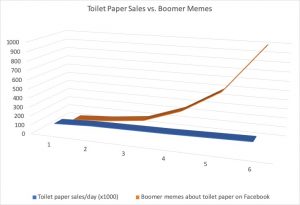
This one is tricky, but shows that while the amount of daily toilet paper sales has only risen marginally in the past week, the amount of Boomers on Facebook sharing unfunny memes about toilet paper and toilet paper alternatives has climbed exponentially in the same amount of time. What this means for the toilet paper industry, Facebook’s content standards and the general public is unclear. If only there were some way for this infographic to be widely reported, so that the proper authorities could weigh in on this staggering data.
5. We don’t really know what’s going on here.
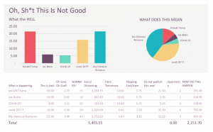
This can’t be good. There’s a lot of colors and even more numbers, but all the categories are labeled with nonsense. Clearly Donald Trump is involved, along with Joe Biden, the frontrunner for the Democratic presidential nomination. Not really sure what covid-20 is, or how My Chemical Romance even fits in at all. Basically, we’re in big trouble.
New York Times, we demand answers.


